Latitudes 28.
2021. end-of-study project.
A-D. design editorial. motion.
LATITUDES 28 is a cultural as well as a living space, where coffee consumers will be given the chance to rediscover this product!
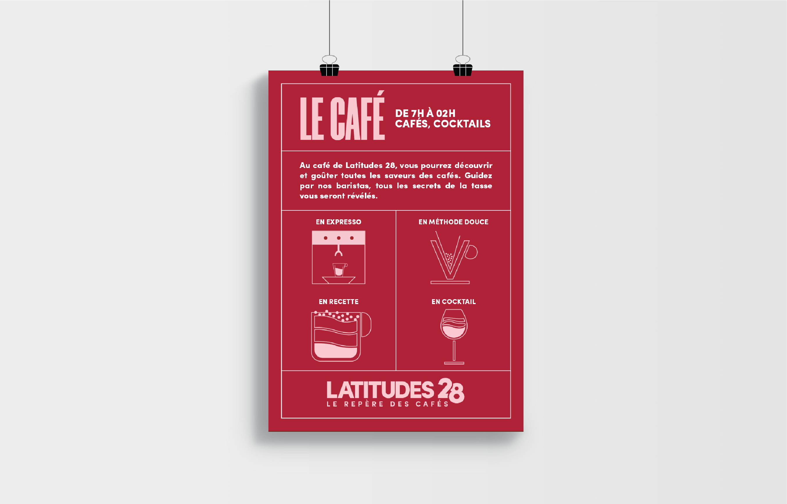
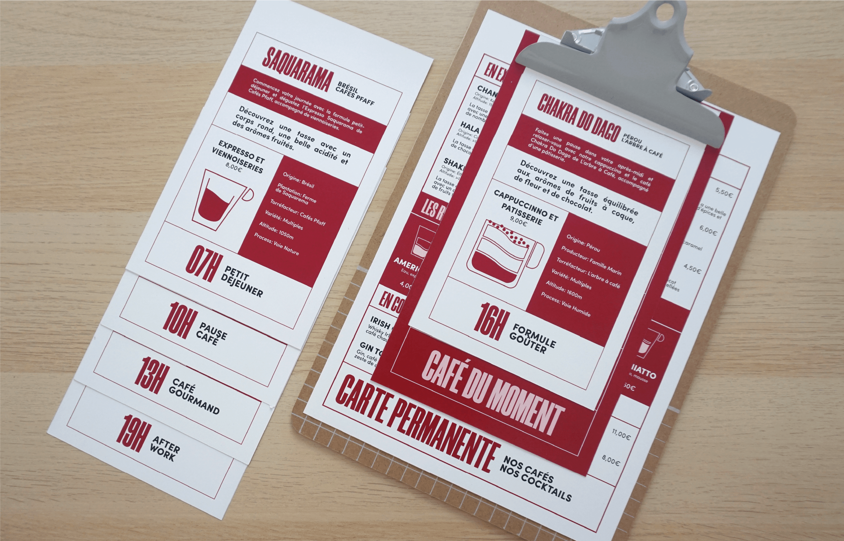
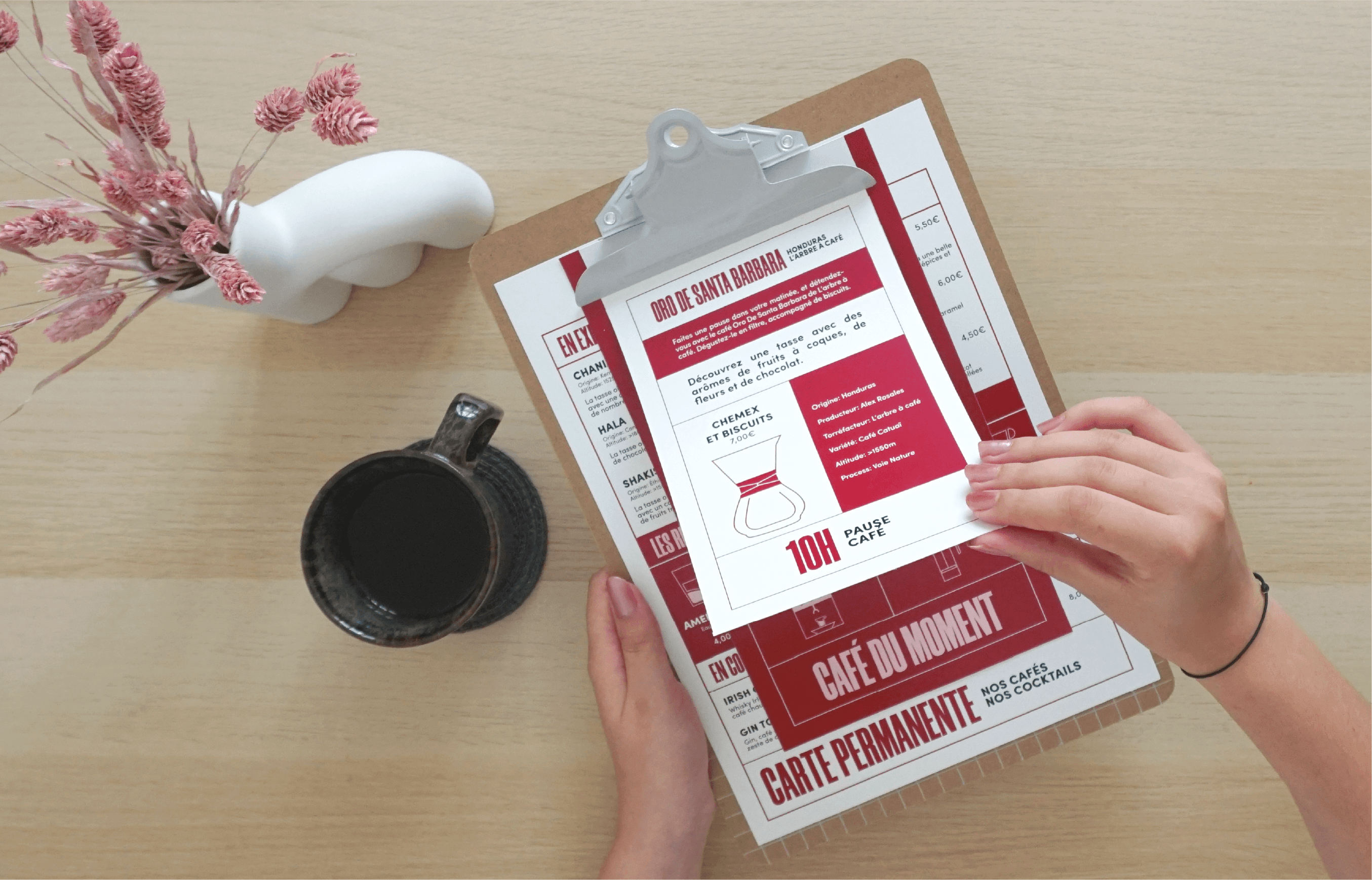
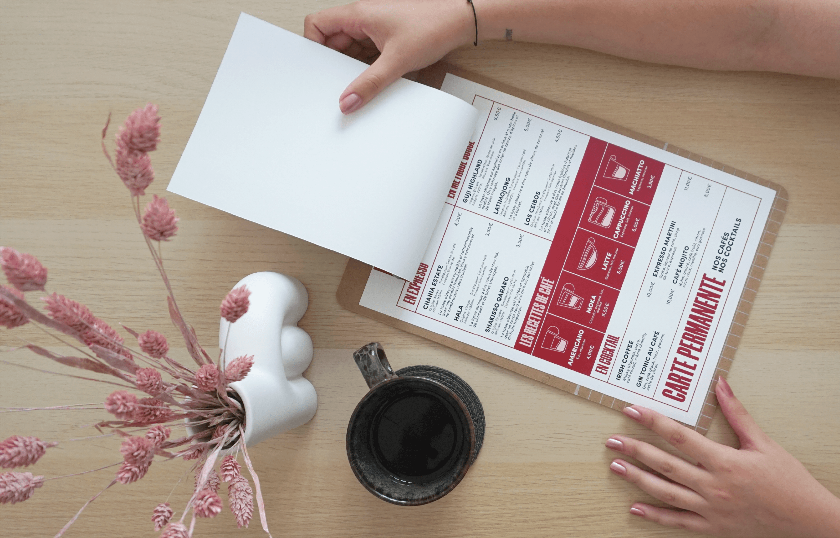
In this place, you‘ll find numerous activities. Temporary exhibits allows visitors to have a journey and to be completely immersed in the coffee world. They‘ll be able to discover terroirs and coffee suppliers from around the world and discover different jobs such as baristas or roasters. The coffeeshop enables the visitor to rediscover coffees from different terroirs, different preparations and different recipes. Discover the star product, the formulas as well as permanent blends. The Workshop also allows for barista courses, as well as tarsting and cooking courses, to learn how to unveil all of coffee‘s flavors. The conference provide encounters between amateurs, anlookers and professionnels. Discover their carreer paths and speak with them now.
name. logo.
Specialty coffees come from Arabica coffee trees. These trees grow up in tropical areas between the latitude North 28 and latitude South 28 and in altitude. Therefore, the name of the cultural coffee center will be “Latitudes 28”. This name makes a direct reference to agricultural regions and to the origin of coffee. It offers travel, discovery notions, and so it incorporates all values of the cultural center.
icon.
The icons occupy a major place in Latitudes 28‘s graphic chart. They are used in all contents (print, web, video). The communication is easier and concise thanks to them. They allow to illustrate and to animate all the statements made.
colors.
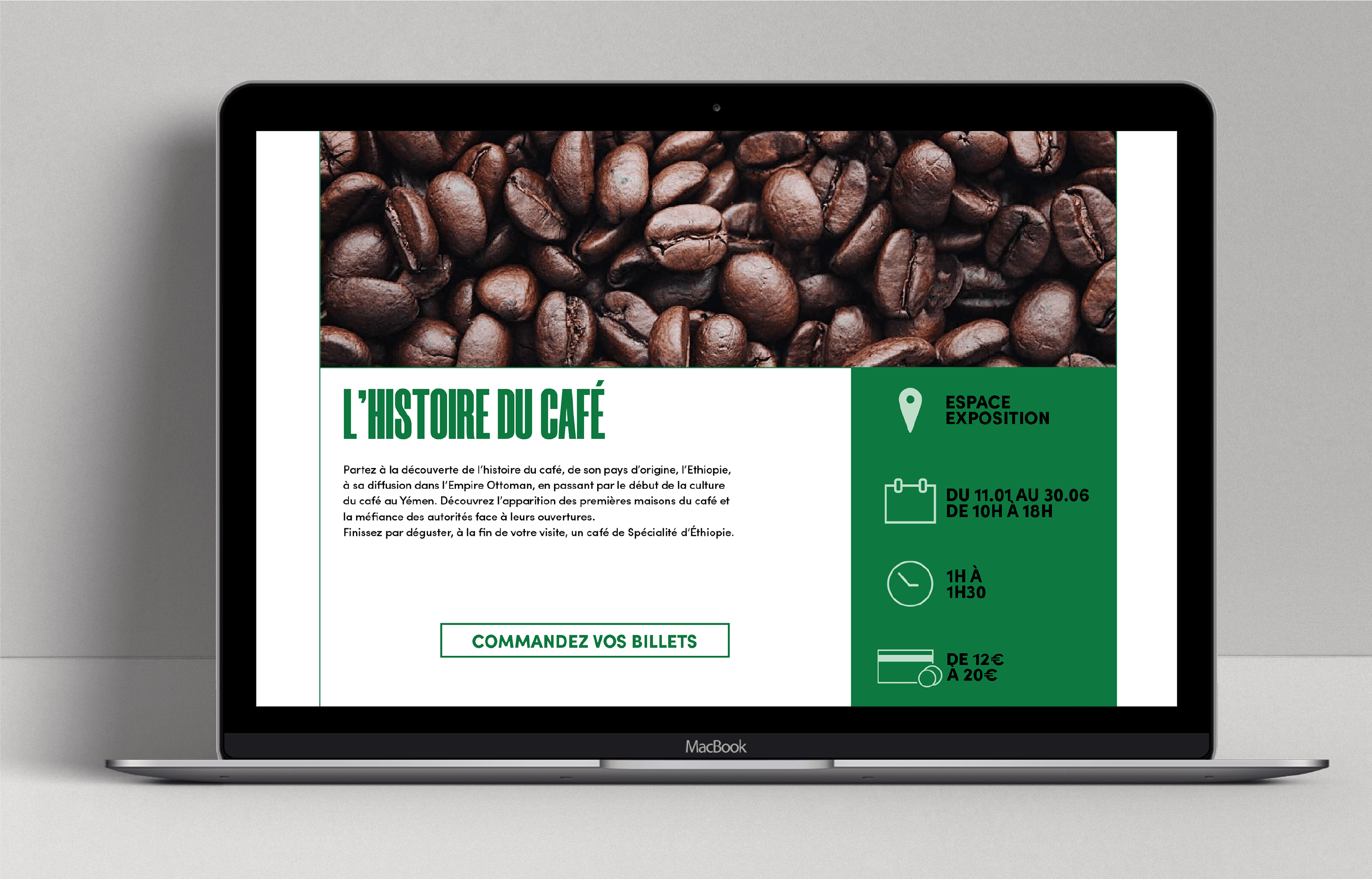
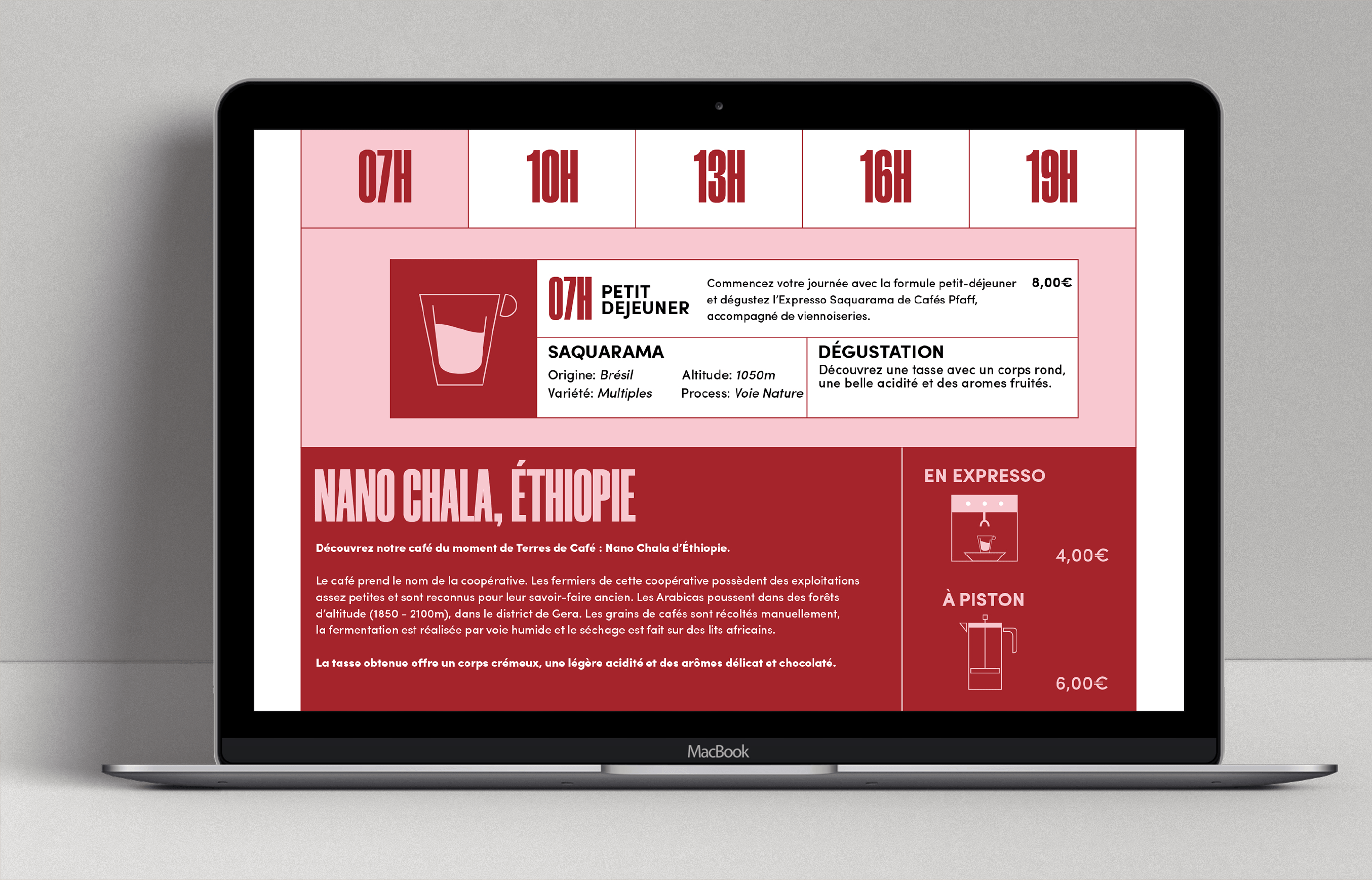
The colors which have been chosen are brown, green, red, yellow and purple. These colors refer directly to coffee trees and coffee berries. Each one represents a specific area in the center: brown for the overall graphic chart, green for Exposition, red for Coffeeshop, yellow for Workshop and purple fort Conference
website.
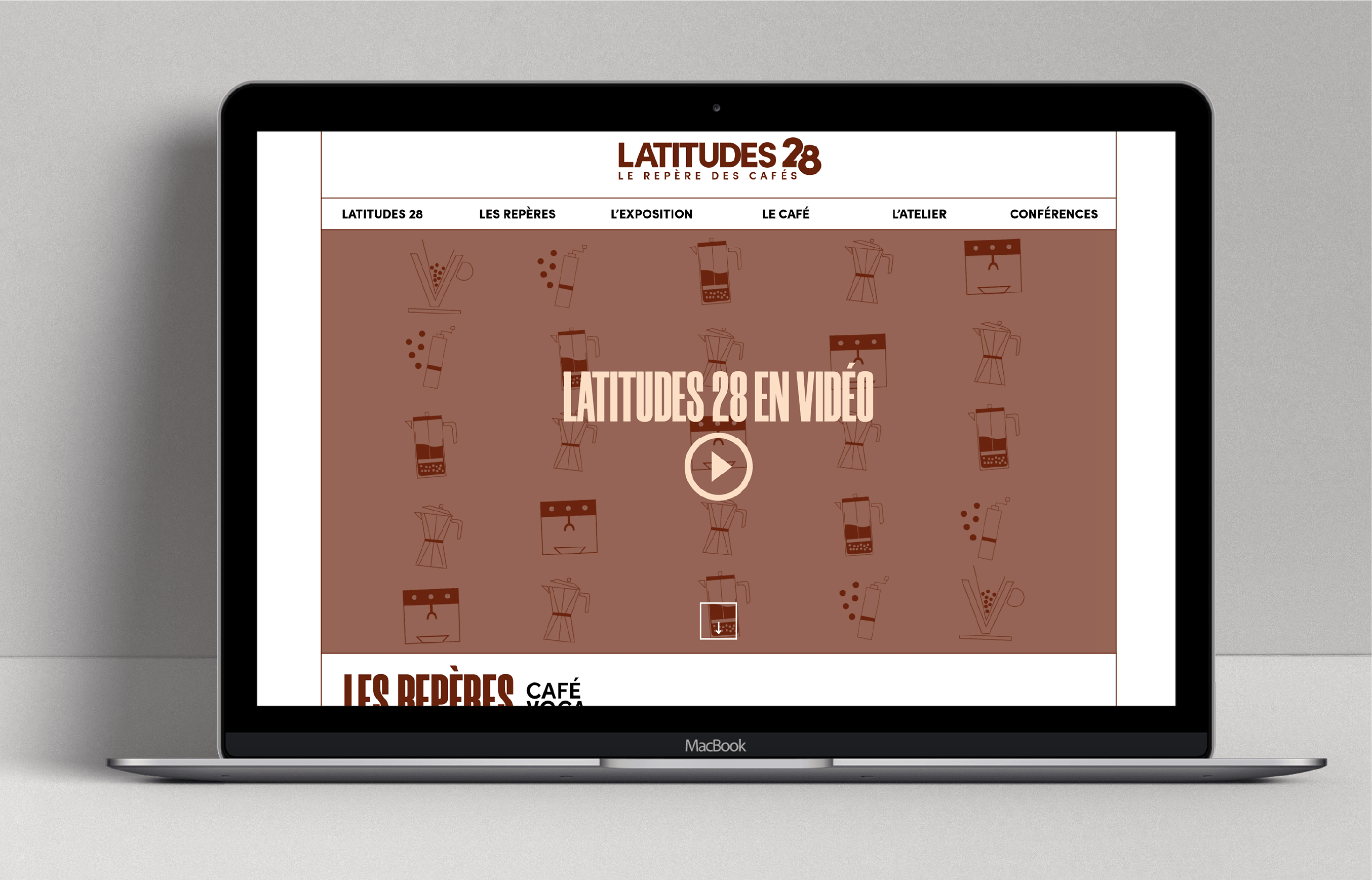
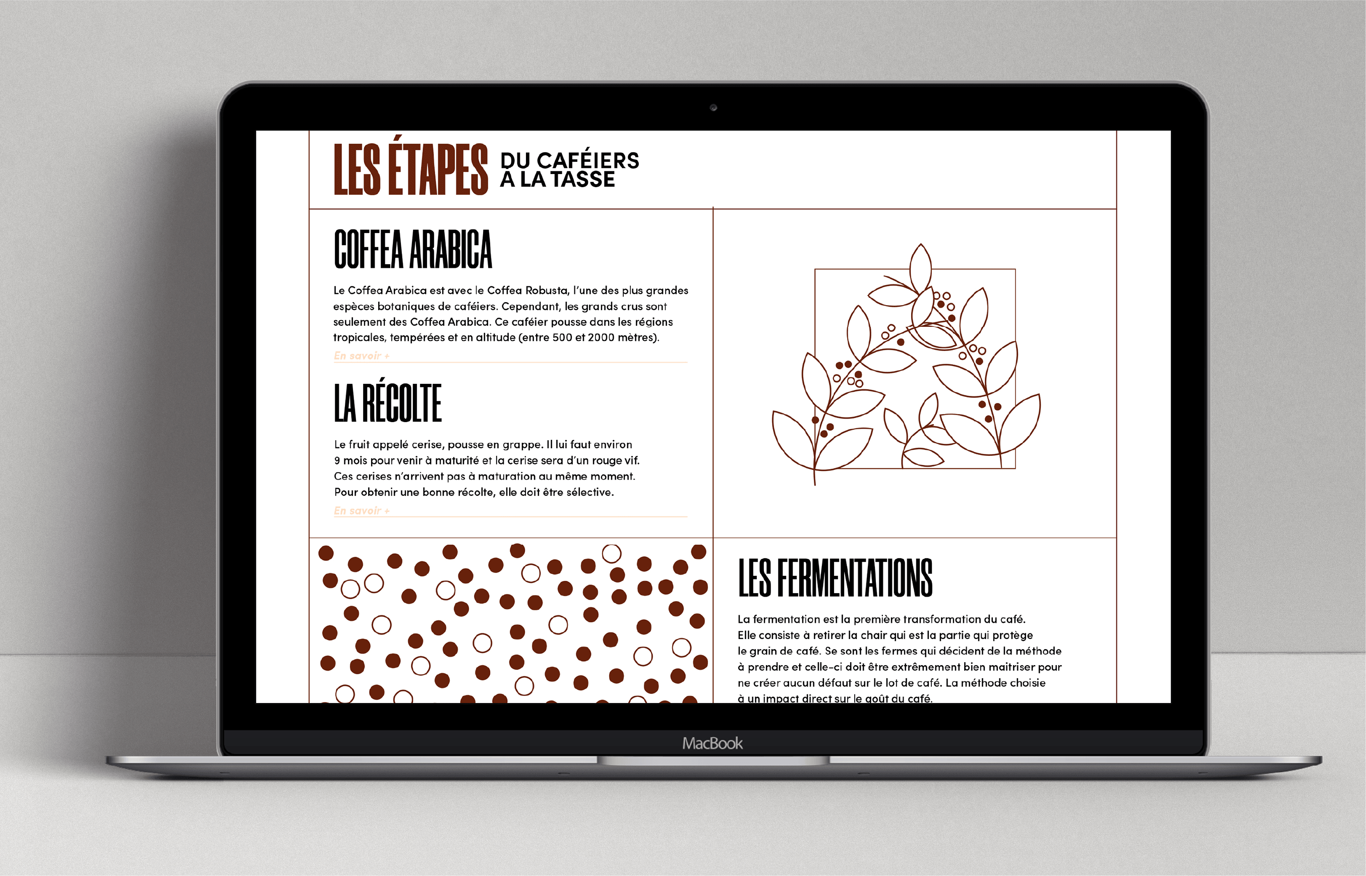
The website allows to find all information about the place and activities. Each part has its own page and uses its own color. Moreover, you can find “Les Repères” page which offers a full explication about coffee.
